CLIENT CASE STUDY
Anjali Temples
Enshrining tradition in a new visual identity.
INDUSTRY
Marble & Wooden Temples
SERVICES
Brand Identity
CLIENT
Anjali LLP
01
The Sacred Brief
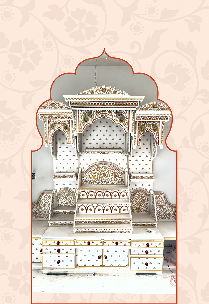
Anjali Temples, a legacy brand crafting custom Vastu-compliant marble and wooden temples, needed a definitive visual identity moving beyond just a name.
CHALLENGE
Design a Brand Identity reflecting their craftsmanship, spiritual depth, and the client's devotion, moving beyond just a name
STEP 02 — CONCEPT
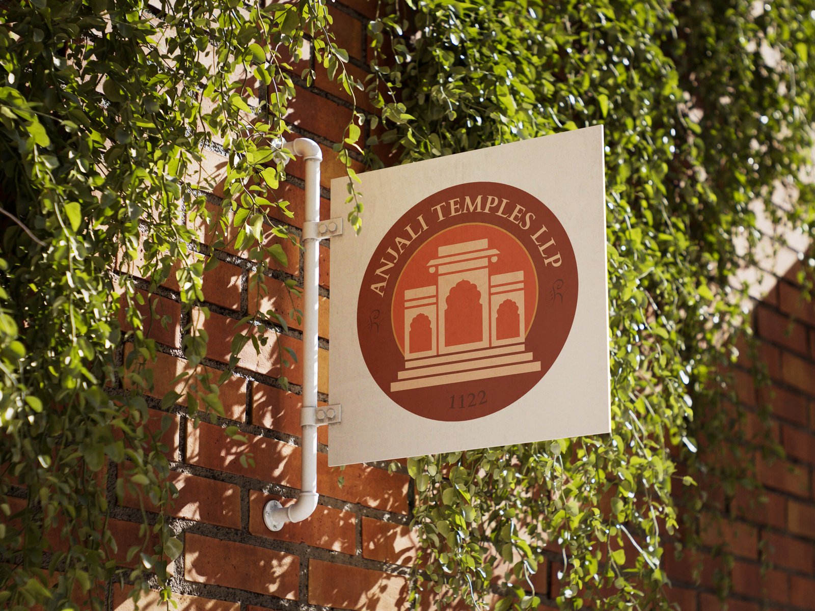
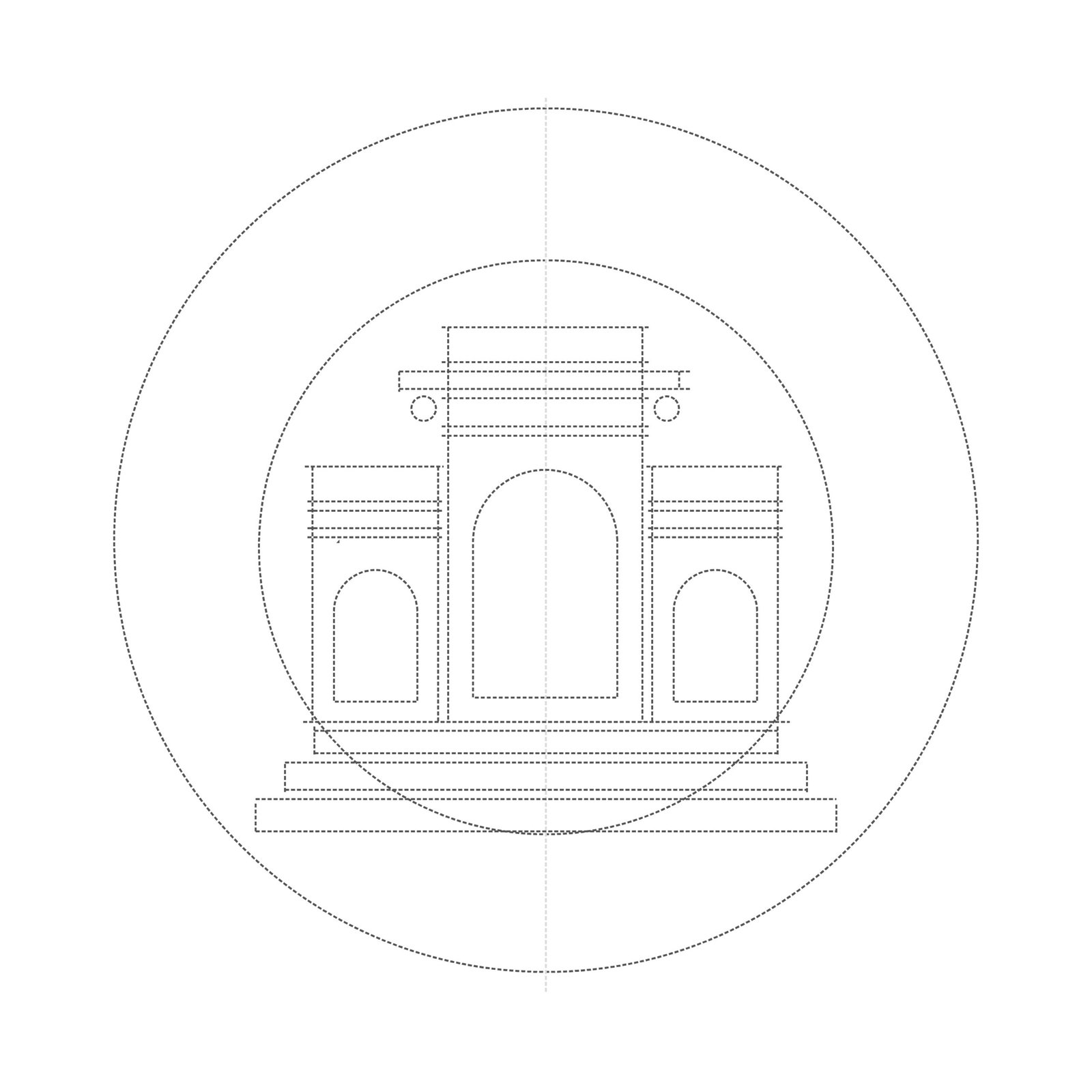
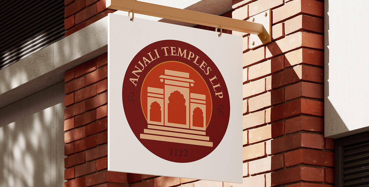
The Circular Emblem
The stylised temple icon subtly depicts growth and ascent towards divinity.


Circumferential Typography
Arched typography reinforces the emblem's timeless heritage.
STEP 03 — VISUAL LANGUAGE
Sacred Palette
Rich tones of brown, gold, and warm orange evoke devotion and a welcoming embrace.
Primary
Gerua
BACKGROUND
Deep Brick
ACCENT
Kasturi
SECONDARY
Chandan
ACCENT
Vibhuti
03
The Divin Unveiling
THE TRANSFORMATION
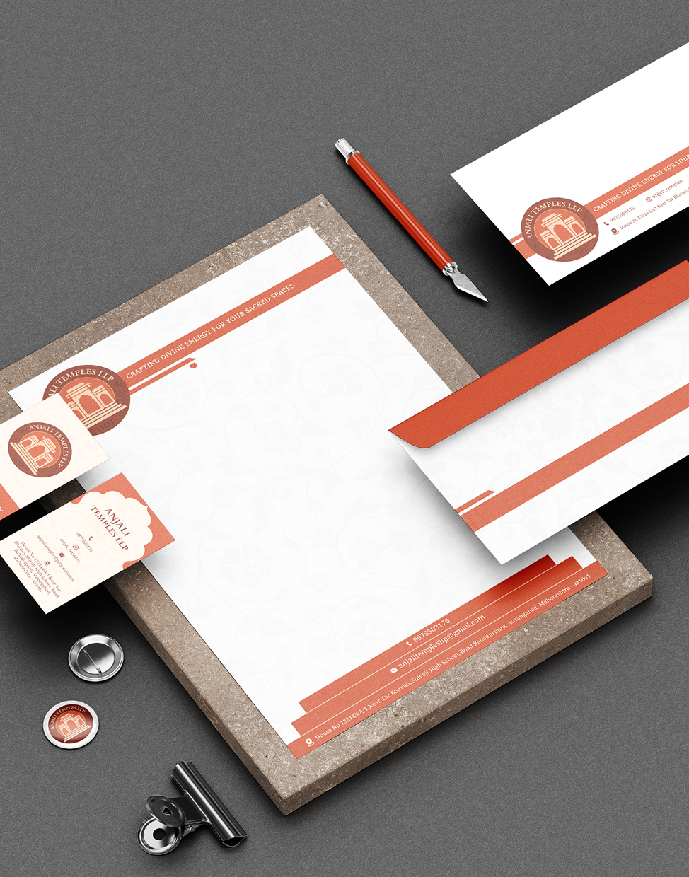
The final identity replaced their previous name-only recognition with a tangible, memorable mark. It provided a highly adaptable design system.