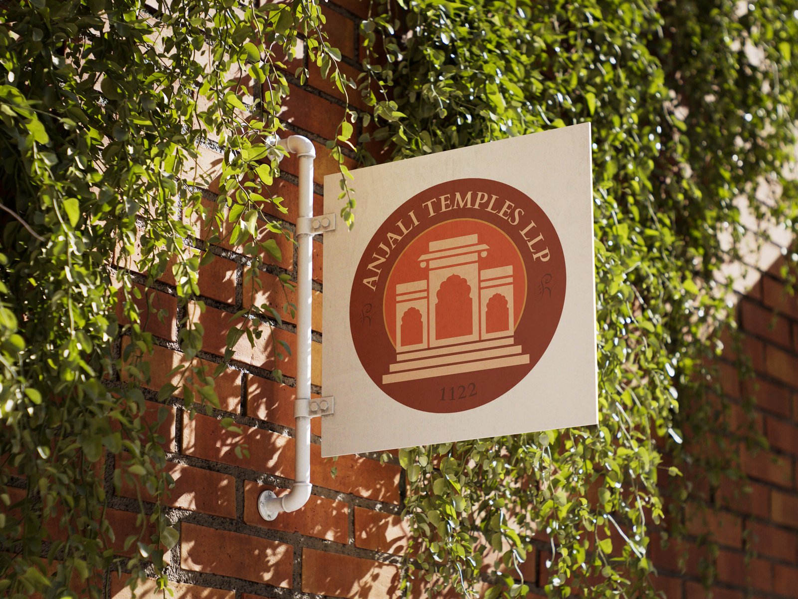
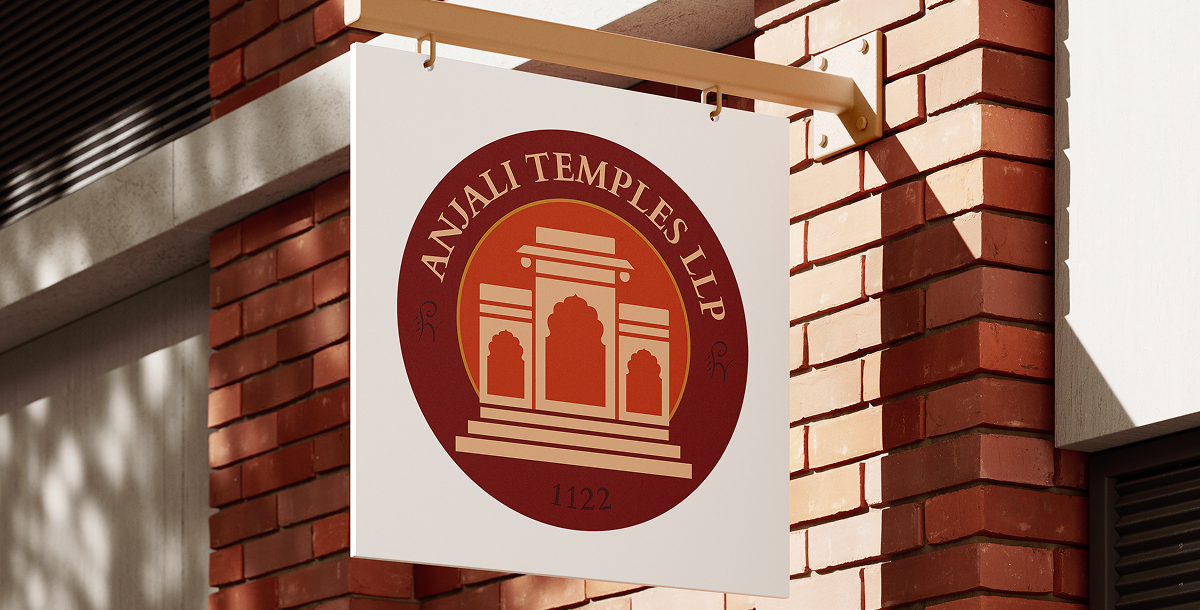
Anjali Temples, a legacy brand crafting custom Vastu-compliant marble and wooden temples, needed a definitive visual identity moving beyond just a name.
CHALLENGE
Design a Brand Identity reflecting their craftsmanship, spiritual depth, and the client's devotion, moving beyond just a name
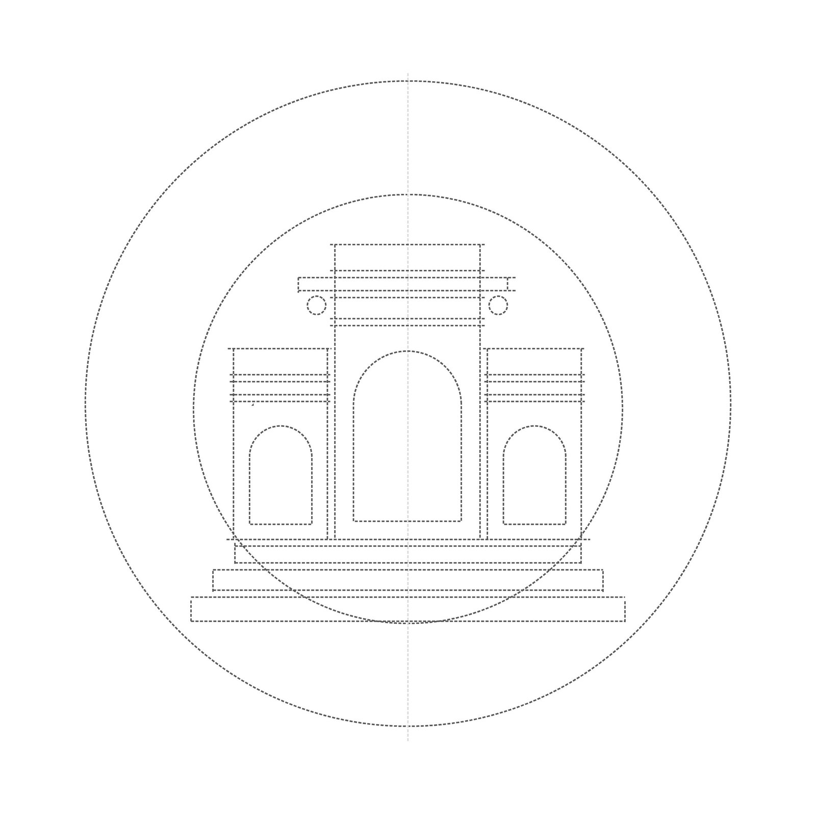
STEP 02 — CONCEPT
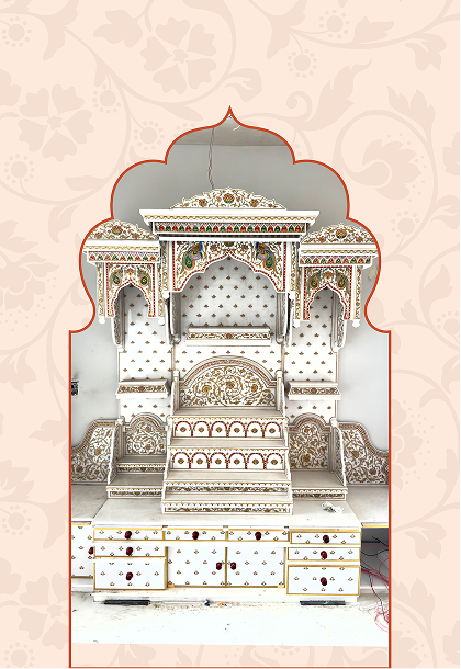
The Circular Emblem
The stylised temple icon subtly depicts growth and ascent towards divinity.
Circumferential Typography
Arched typography reinforces the emblem's timeless heritage.
STEP 03 — VISUAL LANGUAGE
Sacred Palette
Rich tones of brown, gold, and warm orange evoke devotion and a welcoming embrace.
Primary
Gerua
BACKGROUND
Deep Brick
ACCENT
Kasturi
SECONDARY
Chandan
ACCENT
Vibhuti
03
The Divin Unveiling
THE TRANSFORMATION
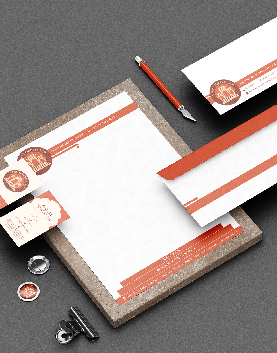
The final identity replaced their previous name-only recognition with a tangible, memorable mark. It provided a highly adaptable design system.
THE IMPACT
The new brand identity was met with immense client satisfaction, becoming an instant source of pride for the Anjali Temples team.
The warm palette and emblem perfectly encapsulate their craftsmanship, resonating deeply with clients' spiritual journeys to serve as a strong foundation for their continued legacy across all touchpoints.
Ready to Define Your Brand's Essence?
Let's craft a distinctive and impactful brand identity that resonates with your audience and elevates your presence.